01
Brand Direction
Defined the product tone as premium, warm, and giftable, then used that direction to guide the visual identity and packaging appearance.
A branding-driven packaging project that explores how a chocolate product can be shaped through visual identity, product tone, packaging structure, dieline design, and physical prototype presentation.

This project is more than a packaging exercise. It explores how branding thinking can transform a chocolate bar into a more complete product experience through visual identity, tone, structure, and presentation.
The design direction focuses on creating a premium and memorable impression, while still considering practical packaging details such as dieline accuracy, folding structure, alignment, and production readiness.
By combining brand identity and packaging execution, this project presents a complete concept from visual direction to physical prototype.
A product branding concept supported by packaging design, visual identity, dieline planning, and prototype development.
Focused on brand tone, typography, color, layout, packaging structure, and how the product appears as a physical object.
Adobe Illustrator, Adobe Photoshop, and Procreate.
The brand direction was built around a chocolate product that feels refined, warm, and giftable. Instead of relying only on decoration, the design uses visual hierarchy, color, and layout to create a stronger product personality.
The intended audience is someone looking for a chocolate product that feels more thoughtful than an everyday snack. This positioning influenced the package composition, front-facing visual impact, and overall presentation.
The result is a branding direction that connects product appearance with emotion, taste expectation, and shelf presence.
The project was developed through brand positioning, visual design, packaging structure, and hands-on prototype production.
Defined the product tone as premium, warm, and giftable, then used that direction to guide the visual identity and packaging appearance.
Developed the typography, color palette, visual hierarchy, and layout composition to create a recognizable product identity.
Built the packaging through dieline planning, folding structure, alignment, and physical mockup production to test the final presentation.
The project shows how packaging can become part of a brand experience, not just a container. The visual system, structure, and physical presentation work together to communicate product value.
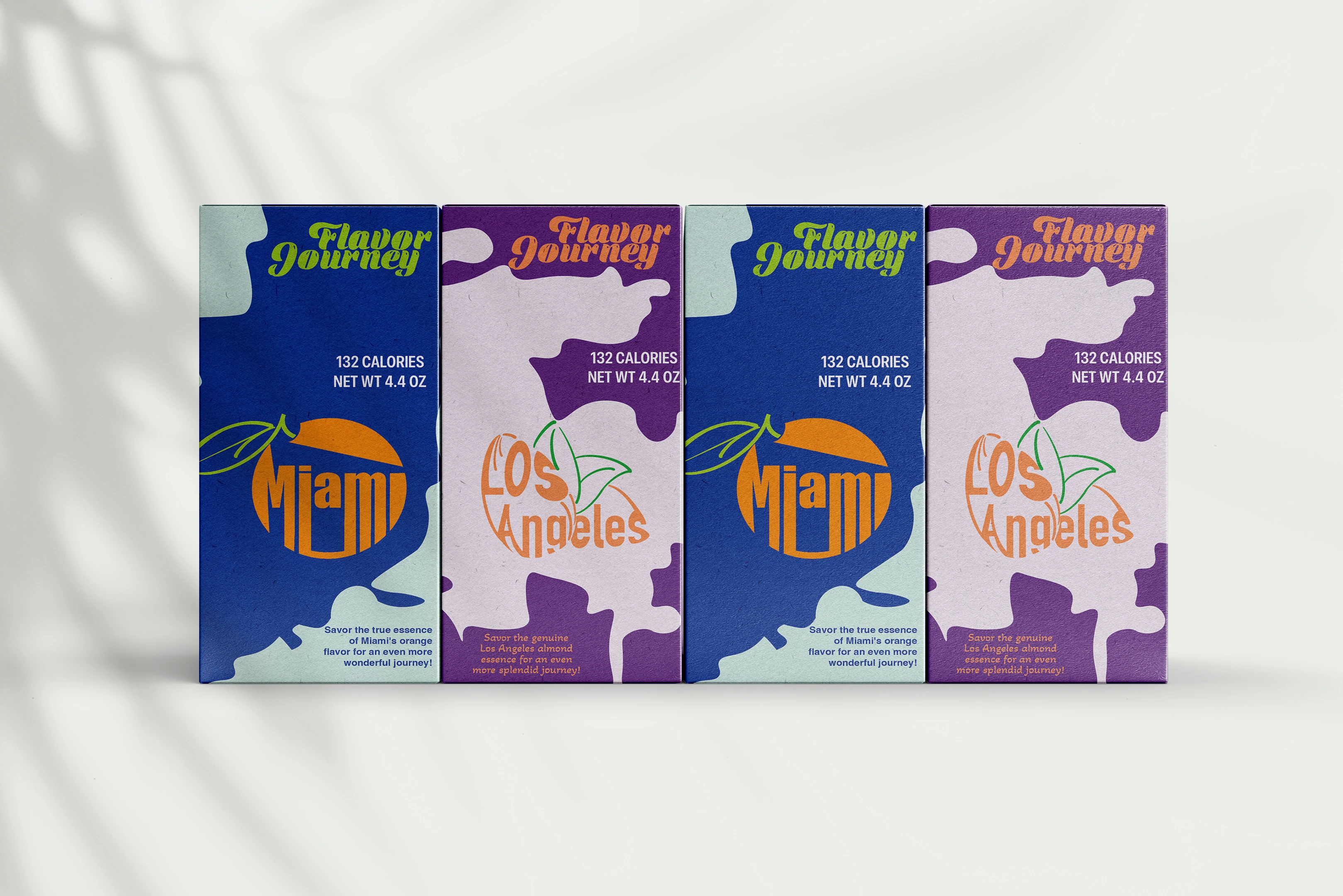
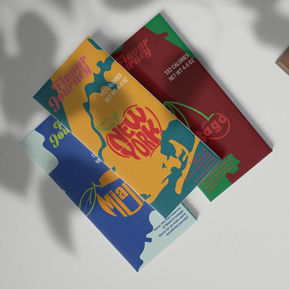
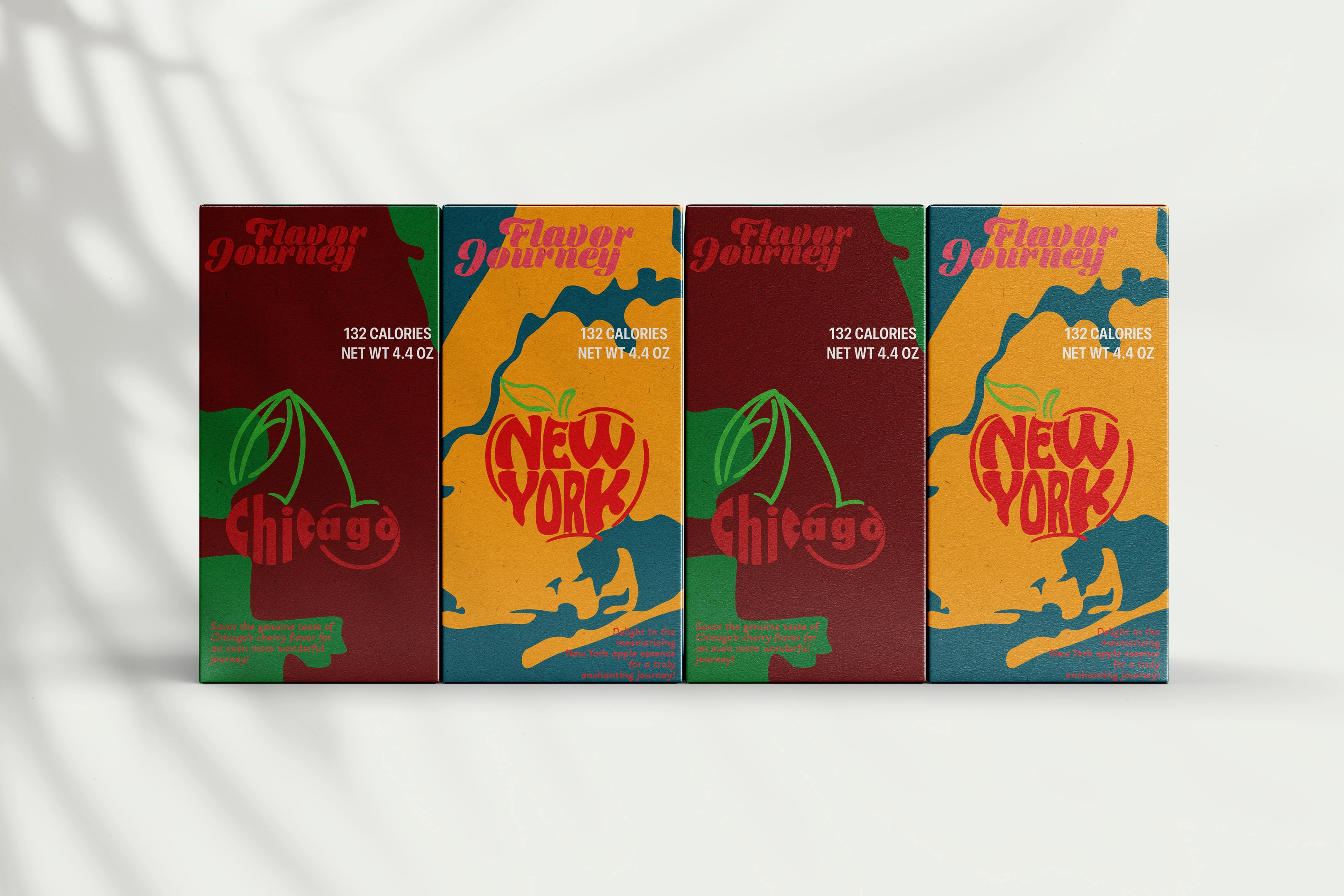
Selected views showing the chocolate bar packaging concept, including front-facing visual identity and physical product presentation. Click each image to view a larger preview.
The final project presents a chocolate bar as a complete product identity, combining brand tone, visual design, packaging structure, and physical prototype execution. It demonstrates my ability to connect branding strategy with hands-on packaging design and production thinking.